JrKripto Website
As the Lead UI/UX Designer, I spearheaded the end-to-end design strategy for the JrKripto ecosystem. My focus was on transforming complex blockchain datasets and AI-driven analytics into a seamless, intuitive interface that empowers both novice and professional traders.

Company
BergX
Project Challenges
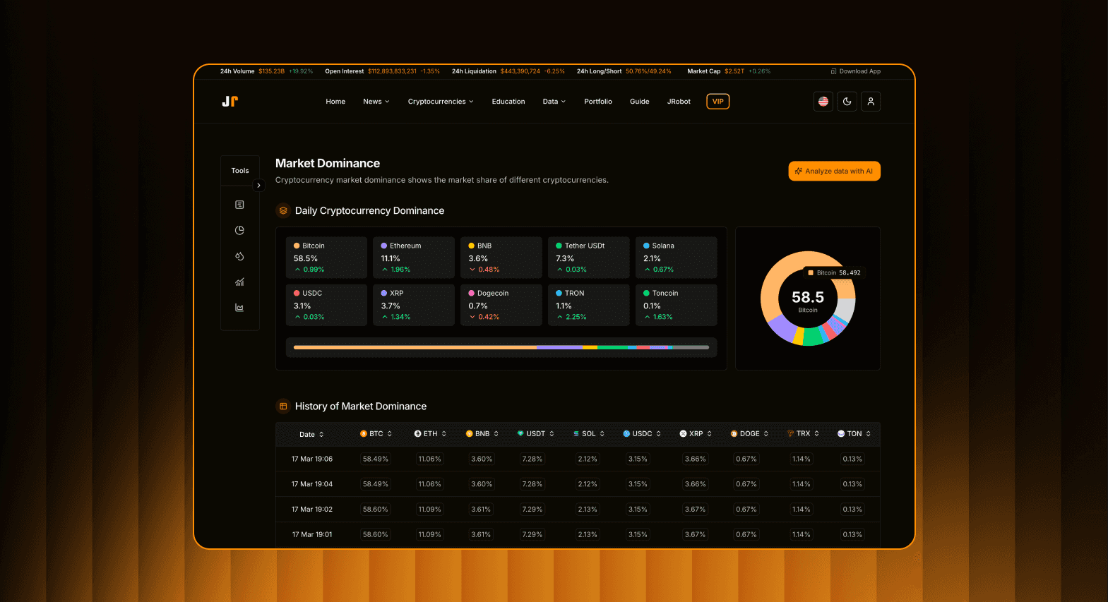
Information Density & Cognitive Load: The ecosystem processes massive streams of on-chain data, AI-driven sentiment, and institutional flows. The primary hurdle was preventing "analysis paralysis" by presenting professional-grade data without overwhelming the user interface.
Mobile Functional Parity: Advanced trading tools—specifically Liquidity Maps and MVRV Ratios—are traditionally desktop-only due to their complexity. Maintaining high-precision functionality on smaller screens was a significant technical and UX constraint.
Trust Gap in AI Insights: AI-generated market trends can often feel like a "black box." Creating a UI that translates automated data into transparent, trustworthy, and actionable intelligence for traders was a core challenge.
Diverse User Personas: The platform had to simultaneously serve "Whales" tracking institutional ETF flows and retail traders focused on the Altcoin Season Index, requiring a UI that didn't feel cluttered for either group.

Design Solutions
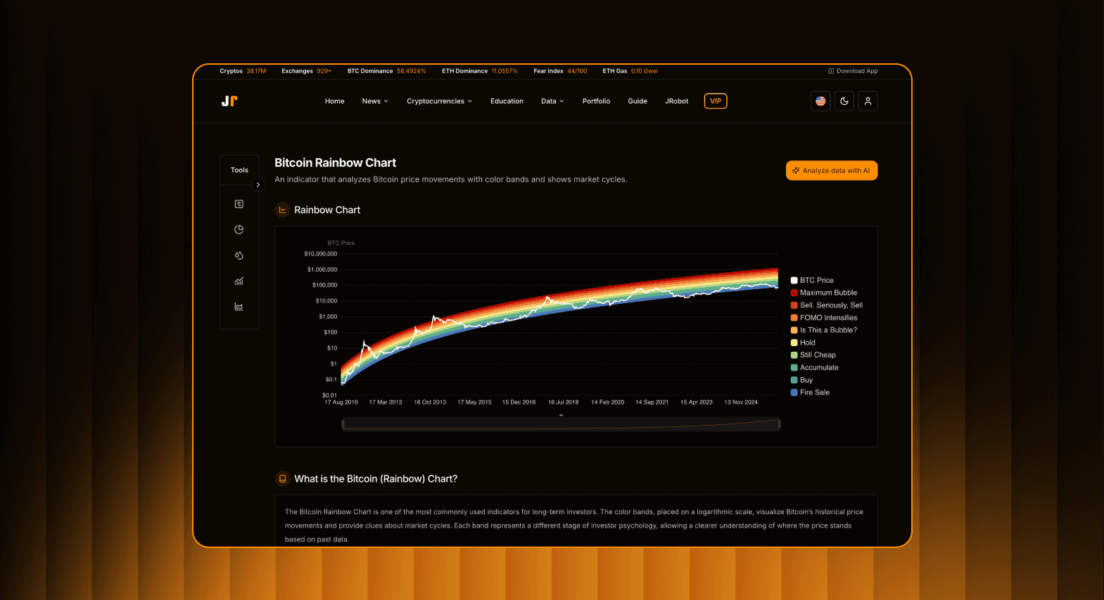
Architected Progressive Disclosure: I implemented a tiered information hierarchy. Users start with macro-level insights (Rainbow Charts) and can drill down into micro-level data (Long/Short ratios), ensuring complexity is only revealed when requested.
Data Visualization Strategy: I developed custom-designed heatmaps and interactive charts specifically for the mobile experience. Using a Component-Based Design System, I integrated "pinch-to-zoom" functionality and horizontal-scrollable data tables to keep professional tools functional on the go.
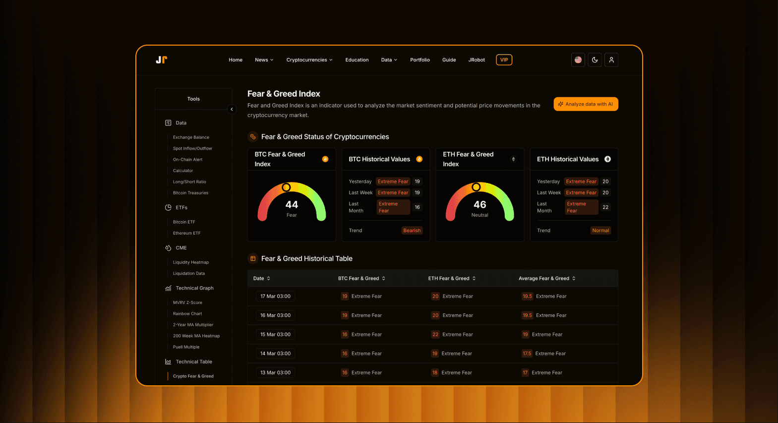
Sentiment Intelligence Dashboard: To bridge the trust gap, I designed a visual scoring system using color-coded stress levels and probability metrics. I added "Context Tooltips" that link directly to source data, providing the transparency needed for high-stakes decision-making.
Modular Workspace Customization: I led the design of a flexible interface that allows users to prioritize their own data sets. Whether a user is focused on Bitcoin Treasuries or Subnet analytics, the dashboard adapts to their specific trading style, reducing UI noise.
User Research
User Persona Mapping: I identified two primary user personas: the "Data-Driven Retailer" (seeking simplified AI signals) and the "Macro Analyst" (requiring deep on-chain metrics like MVRV and ETF flows). This helped in tailoring the navigation to suit both quick-glance and deep-research needs.
Competitive Audit: I analyzed existing on-chain tools (Glassnode, Dune, etc.) and found a common gap: most professional tools lack a mobile-friendly interface. This insight became our primary competitive advantage—making "Whale" data accessible on the go.
Usability Testing: I conducted moderated testing sessions with active traders to observe how they interpret "Liquidity Maps." The research revealed that raw numbers were confusing, leading me to design the Color-Coded Heatmap system to provide instant visual clarity on liquidation zones.
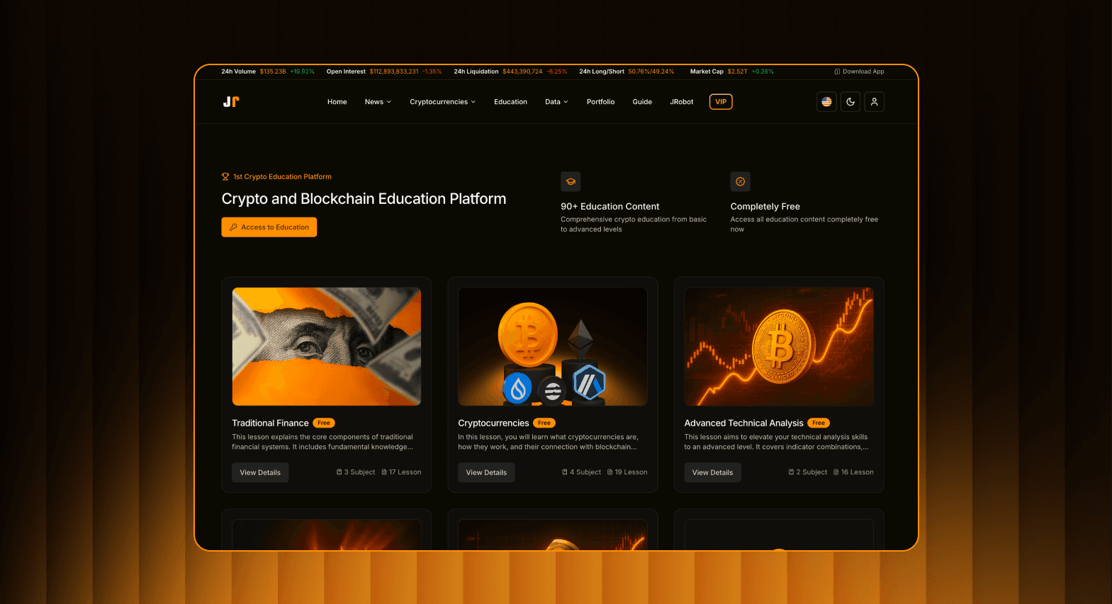
Pain Point Identification: Through surveys, we discovered that "Information Anxiety" was a major deterrent. Users felt overwhelmed by the sheer volume of news. This directly led to the development of our AI-Filtered News Feed, which prioritizes sentiment over volume.
Project Results & Impact
Increased User Retention: Following the UI overhaul and the implementation of the Sentiment Intelligence Dashboard, daily active user (DAU) retention increased by 35%, as traders found the AI insights more trustworthy and easier to act upon.
Mobile Engagement Surge: By solving the challenge of complex data visualization on small screens, mobile sessions grew by 63%. Users began utilizing the platform for real-time alerts and "on-the-go" liquidity tracking.
Reduced Cognitive Load: Our usability testing showed a 40% faster time-to-insight for users navigating the macro-cycle tools (Rainbow Charts and ETF flows) compared to the previous data-heavy tables.
Scalable Design System: I built a comprehensive Atomic Design System that reduced the development hand-off time by 30%. This allowed the engineering team to integrate new $TAO subnets and complex technical indicators with minimal design friction.
Institutional Adoption: The streamlined presentation of "Whale" holdings and ETF data attracted a more professional user segment, successfully bridging the gap between retail traders and institutional-grade analysis.